23 September 2026
Introducing Colour & Pattern to Your Home
A blog by interiors editor, Georgina Blaskey
Georgina Blaskey is a journalist and editor specialising in interiors, design and luxury lifestyle. She is Senior Homes & Interiors at SheerLuxe, and Features Editor for the SheerLuxe Gold Edition. Her work has also appeared in The Telegraph, Country Living and Family Traveller.

It's fair to say Interiors Editor Georgina Blaskey has her finger on the pulse when it comes to the latest trends and looks in the design world. This month, she's tackling how to introduce colour and pattern into her home – and wondering whether the table might be the best place to start.
Maybe it's a pitfall of the job (too much exposure to too many amazingly designed homes), but I'm a fickle friend when it comes to interiors. One minute I'll be admiring the Georgian proportions of a country rectory, the next I'm enraptured by the streamlined finish of a minimalist's city apartment, or the eclectic scheme of a maximalist's treasure trove. In my role as an interiors editor, people often ask me, what's your interiors style? It's fair to assume I have one, but to be honest when it comes to my own home, I'm a bit of a flirt – and right now I'm flirting with pattern.

Balancing Colour & Pattern in the Home – Where to Start
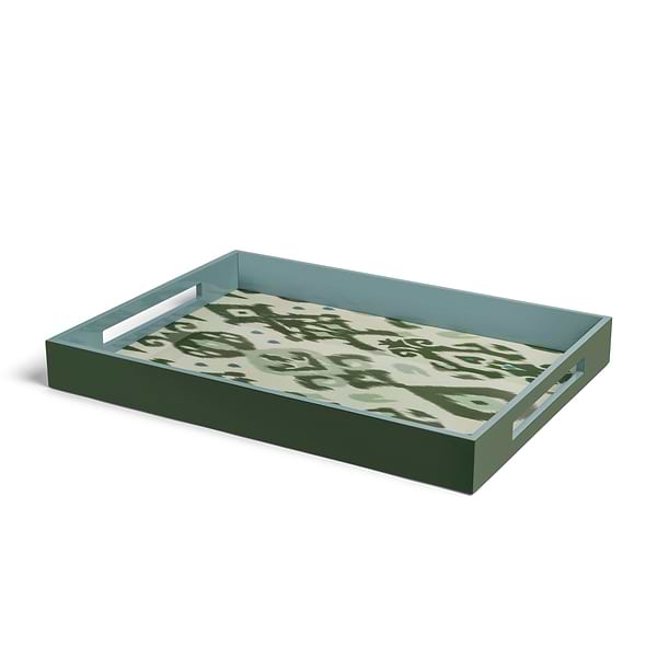
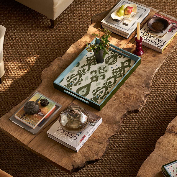
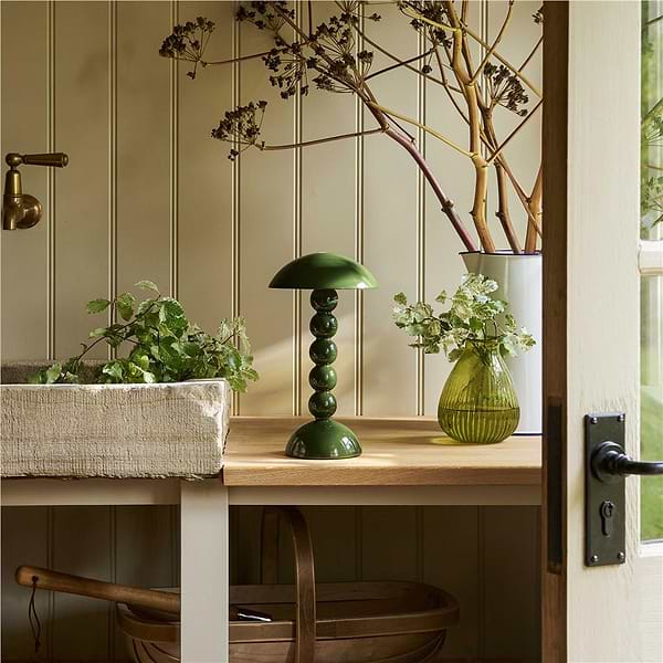
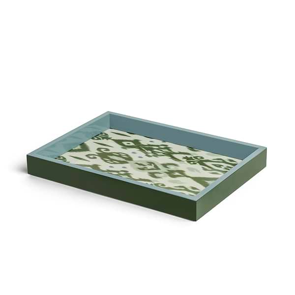
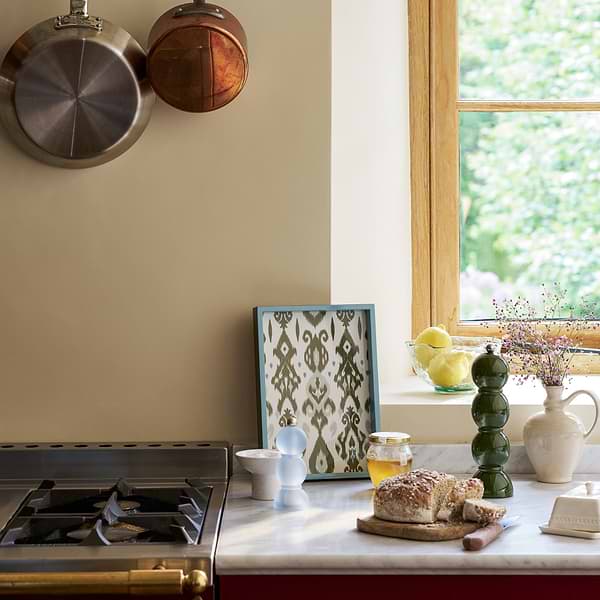
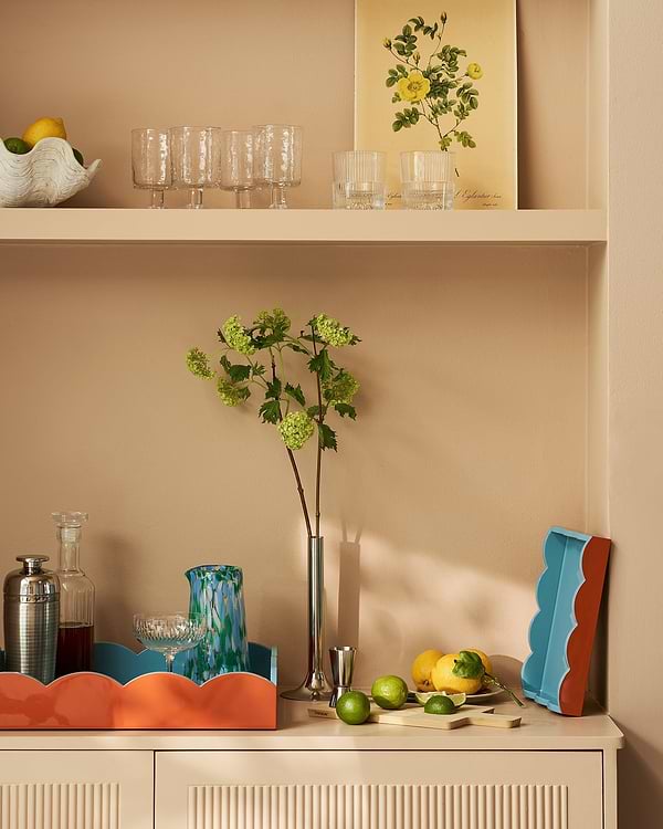
This fledgling relationship involves introducing pattern to some of my fellow residents – neutrals and plains. It's not the first time I've attempted to add something new into the mix, but this time I'm bringing in a professional. Interior designer Laura Stephens is known for her inspiring approach to decorating, and the houses she has worked on are a joyful celebration of colour and pattern – think bold combinations of fabric and wallpaper to create rooms that sing. For my purposes, and for anyone working with an existing scheme, Laura suggests starting with accessories: “A large throw over a sofa, a fun, colourful lampshade, a large glossy tray are subtle ways to dip your toe in the water and introduce some colour. For a bigger impact, but if you're wary of painting a whole room a bold colour, try introducing it onto skirting, the back of doors and architraves. A strong paint colour on the architectural details with neutral walls can look amazing without being overwhelming to live with.”
OK, I'm in, but there must be some rules? Laura says the key is to keep things tonal. “For example, use rich, jewel-toned colours together (deep red, emerald greens, ochre yellows) or, dusty tones work beautifully side by side (grey-toned pinks, blues, yellows). Having said this, I love to throw in a random colour to the mix sometimes to stop things looking too curated and ‘perfect’ – for example, a gloss red, or black lacquer accessory to a pale scheme can look amazing and add an unexpected, grounding element.”

How to Mix Patterns in a Room – Without it Looking Chaotic
So colour doesn't sound too tricky and I'm happily picking out some muted pink tones and chambray blues to add interest to my open plan kitchen/dining space, but I think I want to go one step further. Yes, I'm talking about my flirtation with pattern – I'm ready to go public on our relationship – but how? “Be bold is the answer!” Laura advises, so I've decided to try it on the dining table. It's a space where I can go all out or pare back, and I can leave it dressed or remove everything if I get cold feet. But how do you make it work? “You can mix floral prints as long as the patterns are at different scales – an example would be a large scale floral print on a tablecloth combined with a small, ditzy print on the napkins,” Laura says. “Don't be afraid to mix pattern styles. I love mixing florals with ikat prints and stripes with chintzy florals to add a little edge to a scheme and stop it looking too twee. As long as they're in the same colour palette, or, for example, you pull out a colour from the floral to use on the stripe, the mix can be really impactful.”

Patterned Tablescape Styling
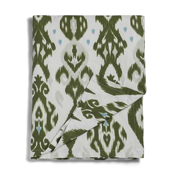
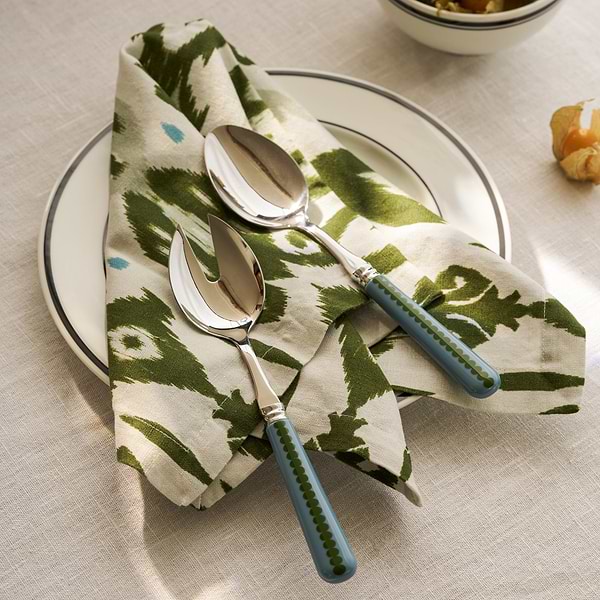
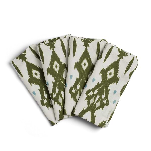
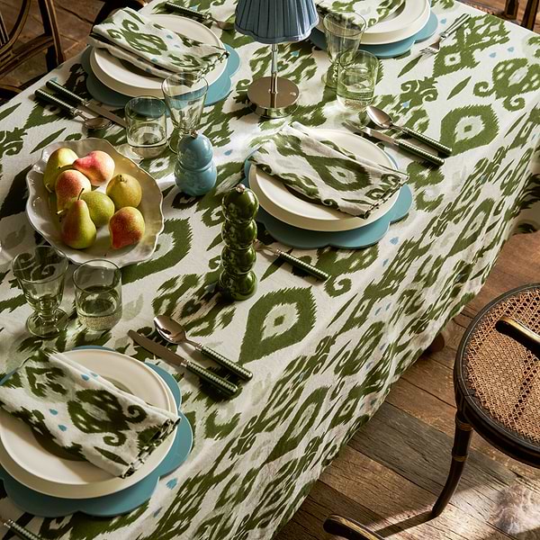
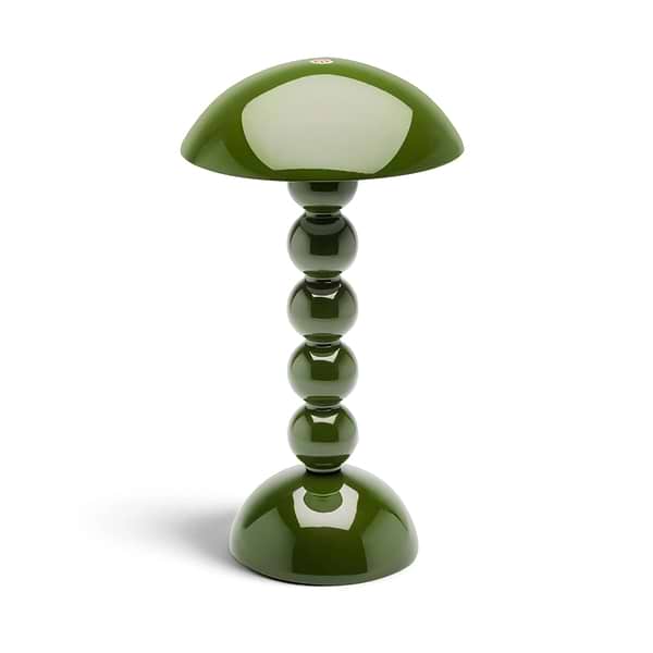
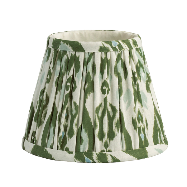
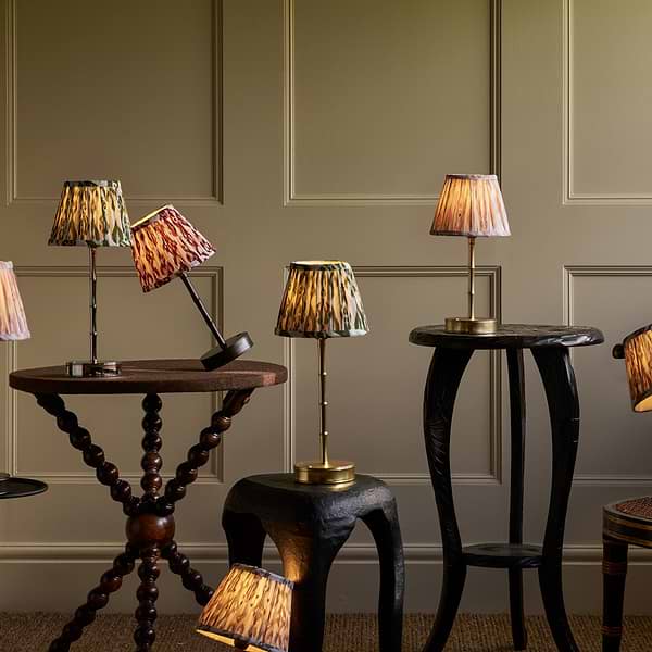
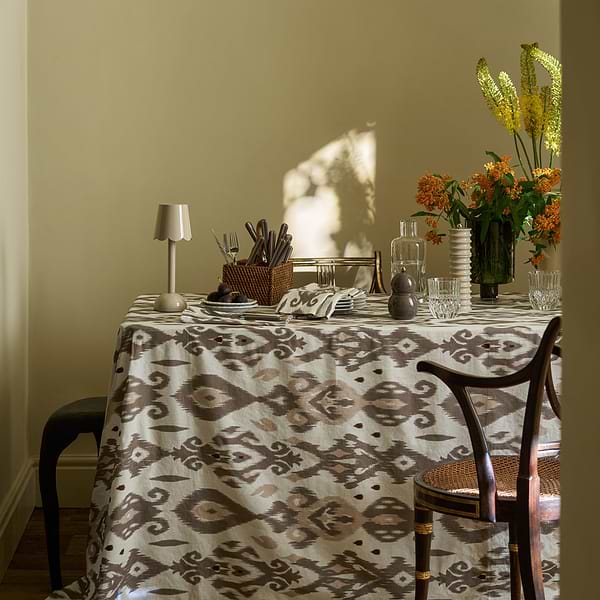
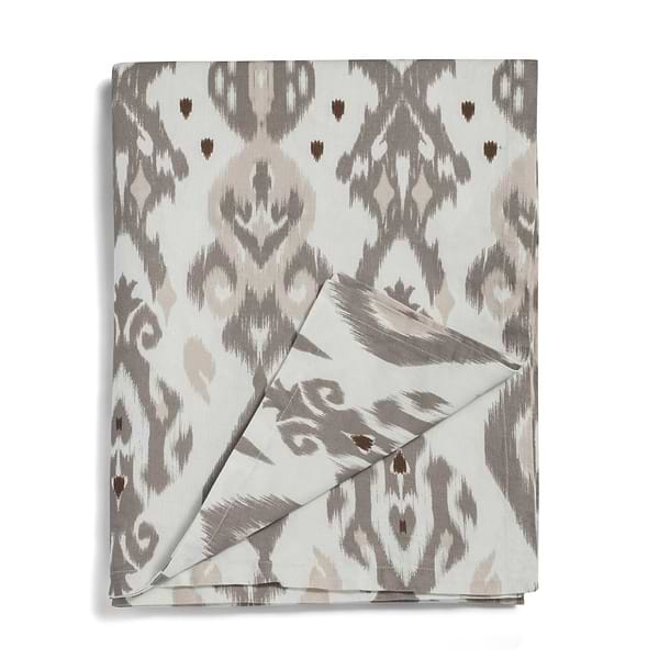
So I open my drawer of linen, I lay everything out across the table, throwing the rule book out of the window, playing with different combinations of patterns, styles and scales. I have always loved pink and green together, whether bright and bold or muted and pastel, and over the years, without really realising, I've built up quite the collection of this combination. I think I love how the pair works together in nature, which makes it sit so easily in the home (and play well with neutrals, of course). Into this current mix, I can't resist adding a few items from the Palm Beach Collection – it's the perfect injection of vivid colour and playful pattern to have flirtatious fun with, while not committing to anything permanent. I'll be adding some neutrals and plains too – I'm thinking the statement green tablecloth, layered with the matching napkins, combined with plain placemats and, finally, the new linen lampshades on the gold bamboo lamps: the perfectly placed punctuation point in a chorus of colour.
The Ikat Collection
View All